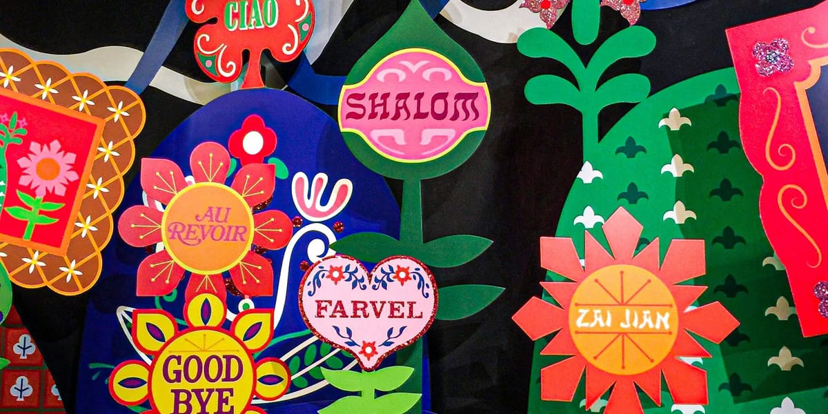
As I continue catching up on Front End Happy Hour, I came across the episode Mixed drinks and Mixed languages. The topic of discussion was on the trials and tribulations that come with trying to create a site / application that is supported globally (i.e., multiple languages).
To be honest, when I first read the episode summary, it seemed like it would be a lackluster topic since after all, it's just a matter of swapping in text right? Well if that were the case, it would certainly make for a boring hour of discussion no?
For the record, I did not really think that translation was a matter of simply replacing English content with the language equivalent. After all, as someone who speaks Chinese more or less fluently, I'm well aware of the difficulties of trying to achieve the "perfect" translation. And more often than not, the translation can fall just short of the original meaning.
As I listened to their stories, a few things stuck out to me:
- The idea that an amazing design built around English content might actually be terrible in another language. For example, simple statements in English could end up being multiple lines of characters in another language. Or what about languages whose letters have different line heights or extra symbols not yet accounted for?
- It is critical to be sensitive to cultural norms with design elements we often take for granted. A simple example of this is imagery. What is perfectly acceptable to us could be completely unacceptable in another country.
- Google Translate might seem like an easy solution to making your site accessible in multiple languages, but the general consensus from the panel is that it is a terrible idea. Now to be honest, I used Google Translate for my go blog for a good while. And though I'm sure that the translation was far from perfect, it served the purpose I needed at the time since it was simply a recreational blog where the readers have low expectations as far as the quality of translation. I would never dream of doing something like that for a professional project though.
- Even though one might expect that people whose language reads from right to left would have similar expectations of UI elements like a video player, that assumptions turns out to be wrong. The reason is because their first introduction to the UI concept was the VCR (which goes from left to right). Fun trivia courtesy of Brian Holt or one of the Netflix engineers if I'm not mistaken.
And though I have yet to take part in a project that requires multi-language support, I feel much more informed on the topic and am glad I took the time to listen to this episode!


